On a recent trip, I visited a beautiful old basilica attached to a monastery.
It was the kind of place that makes you instinctively lower your voice when you walk through the door. Beautiful architecture. Centuries of history. The sort of place where you want to linger and look closely at every detail.
Photography was allowed—but not during Mass.
The church had a sign explaining the policy.
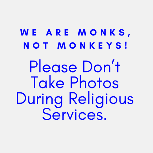
And it made me smile.
It didn’t simply say:
NO PHOTOGRAPHY DURING MASS.
Instead, the message was delivered with a little humor. It acknowledged that visitors might want to take photographs while making it clear that Mass was a different kind of experience. Most importantly, it made it clear that visitors were welcome to stay after the service and take their photographs then.
It was a small sign, but it made me think about signage.
What are we actually telling our guests?
We spend an enormous amount of time thinking about interpretation.
What story are we telling?
What objects are we displaying?
What programs are we offering?
How are we welcoming different audiences?
But sometimes the first—and most frequent—communication a visitor receives isn’t an exhibit label or a docent.
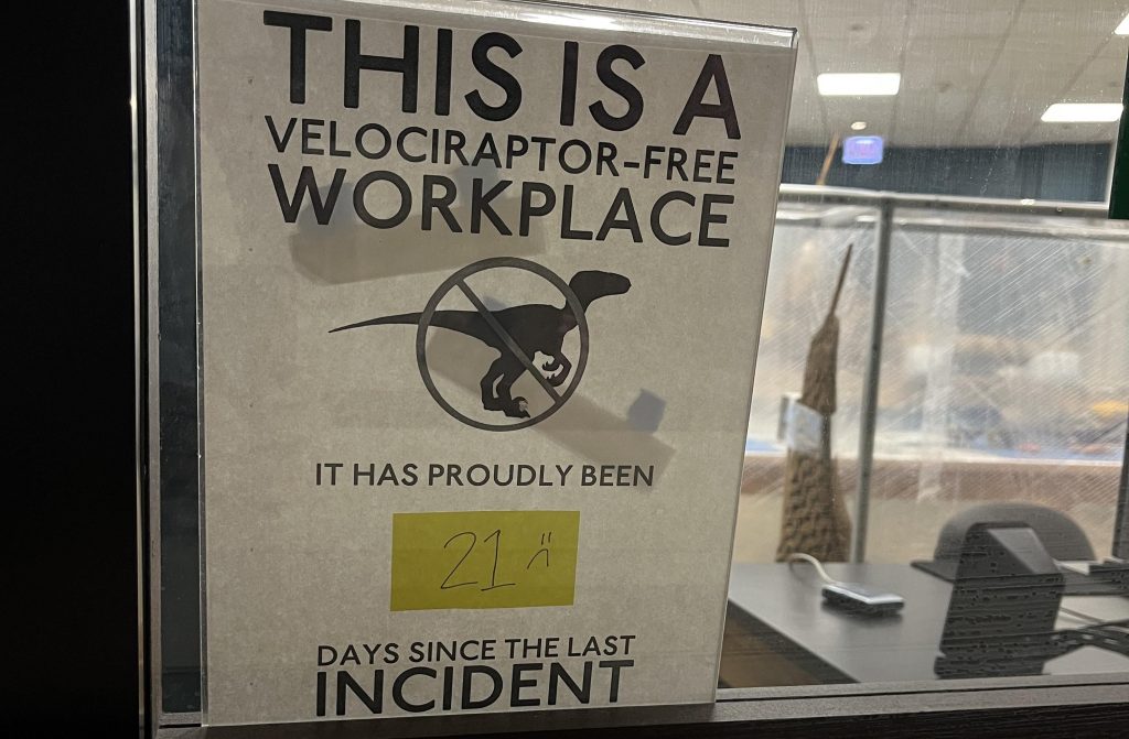
It’s a sign.
And far too often, our signs sound like this:
NO PHOTOS.
NO PUBLIC RESTROOMS.
NO SOLICITORS.
NO PARKING.
DO NOT TOUCH.
DO NOT SIT ON THIS.
EMPLOYEES ONLY.
TOURS ARE NOT AVAILABLE WITHOUT ADVANCE RESERVATIONS.
Technically, these signs may be completely accurate.
But what do they communicate emotionally?
The cumulative message can become:
Don’t do this.
Don’t go there.
Don’t touch that.
Don’t ask.
Don’t stay.
And eventually, the visitor can begin to feel less like a welcomed guest and more like a potential problem that needs to be managed.
There is another way.
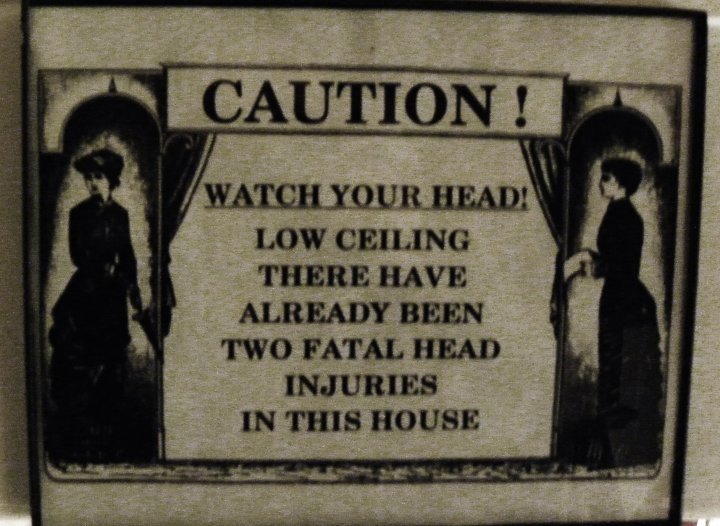
Good signage doesn’t mean abandoning rules.
Museums, historic sites, churches, historic houses and other cultural institutions have legitimate reasons for having policies. Collections need protection. Historic materials are fragile. Religious services deserve privacy. Buildings have capacity limits. Staff need boundaries.
The question isn’t whether we have rules.
The question is how we communicate them.
Instead of:
NO PHOTOGRAPHY
What if we said:
Photography is welcome when services are not in progress. Please help us keep this space peaceful during Mass. You’re welcome to stay afterward and photograph the architecture.
Same rule.
Very different message.
Instead of:
DO NOT TOUCH
Try explaining why:
Please help us preserve this 150-year-old object by looking with your eyes, not your hands.
Instead of:
NO PUBLIC RESTROOMS
Could we say:
Restrooms are available for customers at [location]. The nearest public restroom is [location].
Instead of:
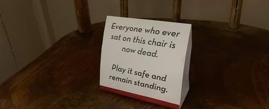
DO NOT SIT ON THIS
Perhaps:
This historic furniture is fragile. Please enjoy it with your eyes so future visitors can enjoy it too.
The goal isn’t to make every sign cute.
And please don’t make every sign a paragraph.
The goal is to make the visitor understand why a policy exists and, whenever possible, tell them what they can do.
Signage is part of the visitor experience.
This is especially important in historic buildings.
Visitors don’t necessarily know which staircase is original.
They don’t know that the beautiful chair they’re tempted to sit on is 175 years old.
They don’t know that photography during a religious service is disruptive.
They don’t know where they’re allowed to go.
They don’t know why a particular room is closed.
We do.
So our signage should help them navigate the experience rather than simply police their behavior.
And there is another reason this matters:
People remember how you made them feel.
A welcoming sign can make a visitor feel like an insider.
A scolding sign can make them feel like they’re already doing something wrong.
And then there are the solo travelers.
As a solo traveler, I’ve encountered another version of this problem:
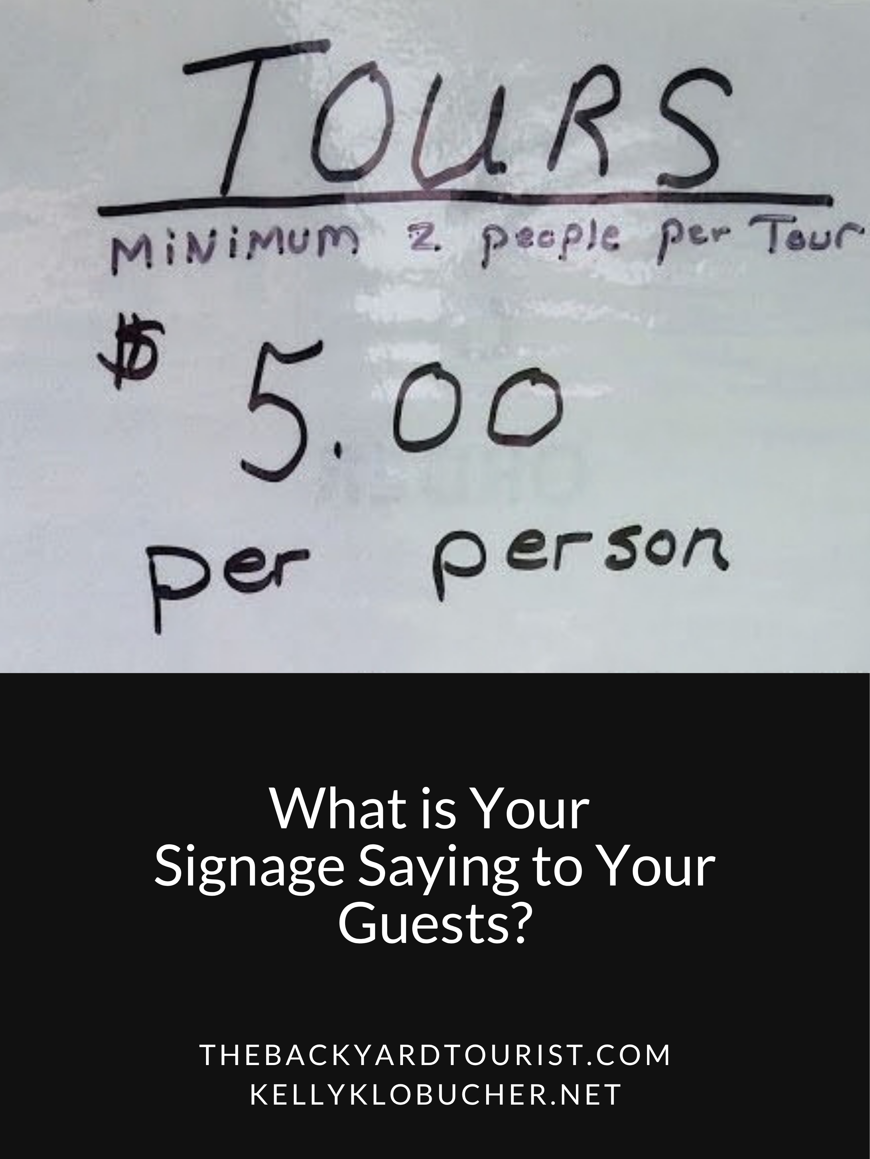
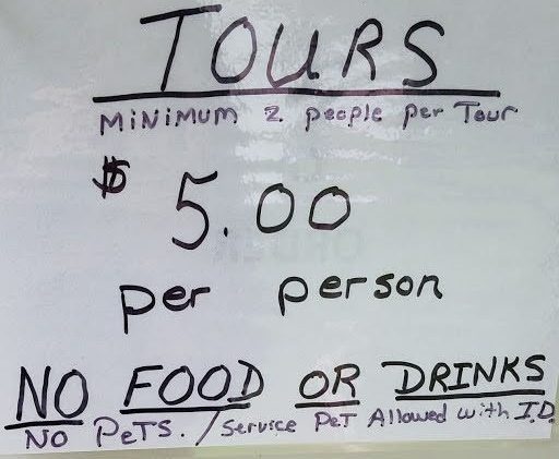
NO SOLO TOURS.
I’ve actually offered to pay for two tour spots just so I could participate.
Sometimes it works.
Sometimes it doesn’t.
I understand the economics. A tour operator may need a minimum number of participants to make a tour financially viable.
I also understand the potential danger/security fear of being alone with a guest.
But from the visitor’s perspective, the message is pretty stark:
You came alone, so this experience isn’t for you.
That’s a problem at a time when solo travel is increasingly common.
And there are often creative alternatives.
Could a solo visitor join the next scheduled tour?
Could they pay a minimum fee?
Could they receive a self-guided option?
Could they be added to a waiting list?
Could the site offer a scheduled “open tour” specifically designed for individuals?
Again, the issue isn’t necessarily the policy.
It’s whether the policy creates a dead end for the visitor—or offers another path forward.
Before you put up the next sign…
Ask yourself:
What are we trying to accomplish?
What does the visitor need to know?
Can we explain why?
Can we tell them what they can do instead?
Does the language sound welcoming—or punitive?
And perhaps most importantly:
If I were visiting this place for the first time, how would this sign make me feel?
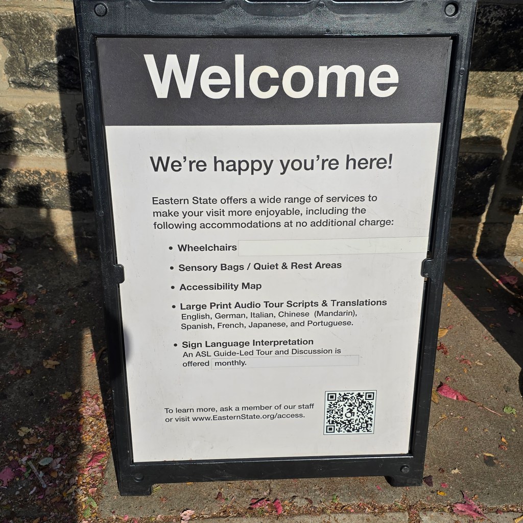
Good signage is more than wayfinding.
It is interpretation.
It is hospitality.
It is accessibility.
It is visitor experience.
And sometimes, a little humor goes a surprisingly long way.
Because the best signs don’t just tell visitors what not to do.
They help visitors understand how to be a good guest.

